The Logo
- Home
- The Logo

The Logo
On Al Sadeem Astronomy’s Visual Identity
By Goffredo Puccetti
Every year, students of my classes of visual design at the New York University – Abu Dhabi are exposed to real briefs from real clients. For the students of the 2018 ‘Yes Logo’ Class, the task was to redesign the logo for Al Sadeem Astronomy.
When Al Sadeem Astronomy owner and co-founder Thabet Al Qaissieh presented the brief to the class, they responded with a supernova-like outburst of creativity students’ proposals involved Galileo Galilei’s sketches of Jupiter and his moons, pure abstract shapes, Orion’s iconic silhouette, dunes, nebulae and more. In conversations with the client, we then focused more and more on the mission of Al Sadeem Astronomy–the more we progressed in our analysis, the more we abandoned any descriptive imagery.
The questions we asked ourselves were: What does Al Sadeem bring to the UAE? What does it mean to do astronomy? What happens when you are into it? So we focused on the thrill of discovery, the love for science, the gaze towards the unknown.

But then, how do you express it visually? Among many sketches, one student drew a kid jumping in the air with joy–that was the breakthrough moment; that was the key. At that moment, I knew what I wanted to design: the emotion of the first time we see a planet or a galaxy through a telescope when we identify constellations for the first time that sense of awesomeness, the connection to what we cannot grasp, the infinite space above us.
By the time the semester ended, we did not have the logo done but I knew that I had to follow the path that was started by the student and draw a logo that would represent these emotions.
So I spent one summer sketching and revising that idea until it reached its actual form.
I wanted to frame the logo in a shape that suggests the partial view of the telescope optics, and to do so I drew an abstract shape. It suggests a night sky, with the Milky Way rising up. It also evokes a connection with the city of Abu Dhabi, whose official logo is inscribed in a similar sail-like shape. But there is more in the shape of Al Sadeem logo it is the shape of the space inside the arabic letter ‘meem’. In typography, that space is named a ‘counter’.
This counter–this inside space–stands for Mansour, the late brother of Thabet Al Qaissieh, who dreamt of the Observatory and to whom it is dedicated.
It is a discrete presence, discernible only when revealed. For all other purposes and for all other viewers, the identity of the silhouette of the person gazing at the sky is unknown.
Is he Ibn Rushd? Is he a random visitor of the Observatory barely containing the emotions of the contemplation of the sky? A woman? A man? An adult or a kid? We don’t know and it does not matter. What matters is to have an image that resonates with the viewer, that generates a connection by pointing to something that we see
but cannot truly understand on our own without assistance. This logo is the guide to discovery, to the quest for the unknown. It whispers in our ears: ad astra.
This visual identity is very dear to me also because we were fortunate enough to benefit from the invaluable assistance of Wissam Shawkat who drew the Arabic version of the logotype. He created the perfect visual matchmaking between the English and Arabic granting a stunning visual coherence to the bilingual signature. I will never thank him enough for this.
The Design Studio Humus Design, my partners in Rome, finalized the master artworks for future implementations.
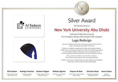
This logo has been awarded the Silver Medal at the prestigious international design awards Wolda (World of Logo Awards) 2020.
I regard the design of this identity as one the most fruitful and rewarding design experiences I have had since I moved to Abu Dhabi–everything I love about Graphic Design and about the UAE is in it.
It has been an honor to design it and I wish Al Sadeem Astronomy all the very best for the continuation of their tremendous work.
Goffredo Puccetti, Abu Dhabi, September 2021
More on the Desgnier
Goffredo Puccetti
Goffredo Puccetti is a graphic designer and faculty of Visual Design at NYU Abu Dhabi.
His research interests span from visual communication to policy making with a special attention to inclusive and cross-cultural design. Prior to joining NYUAD he has been working in Italy, UK and France for blue chip multinational clients all around the world such as: Axa, Mars, NTT Europe, Pirelli, Musée du Louvre, Samick Music.
He has received international accolades for logo design and his students have designed award winning visual identities for prestigious MENA and UAE institutions.
Goffredo is deeply invested in the emerging Emirati design scene and has been an invited lecturer in design conferences and schools in the UAE.

